
the blog
A website can explain everything about a business and still leave people wondering where to click. It happens more often than you’d think. Too much text, too many options, the same point explained three different ways. People get tired of looking. Good website design in Singapore gives visitors what they need without making them work for it. That’s the point of Singapore web design, really: make things clear, not crowded.
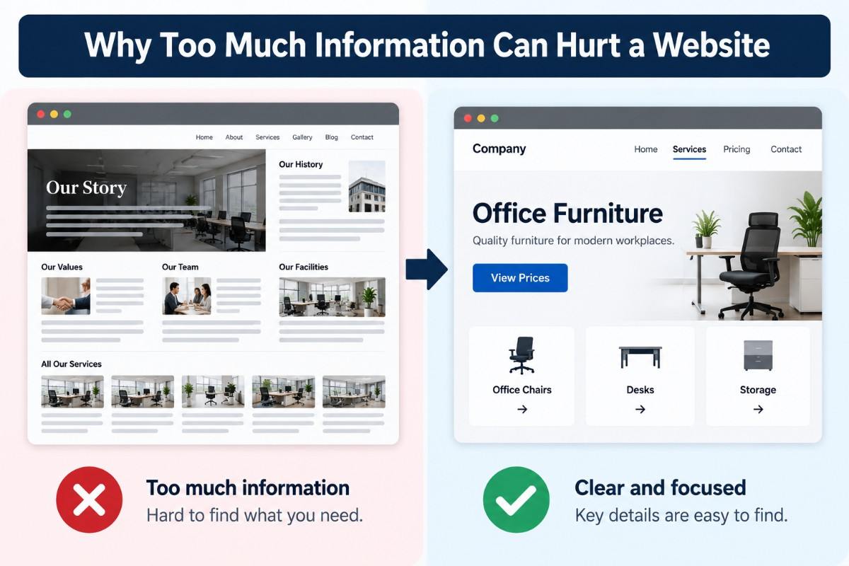
People usually visit a website for a reason. They want a price, a service detail, an answer. They aren’t necessarily interested in the company’s entire history or every feature it offers.
When the useful information is buried, visitors have to search for it. Some will. Others won’t bother.
Most people don’t read a webpage from top to bottom. They scan it. A heading catches their eye, then a few lines, then perhaps a button. If nothing answers their question, they move on.
Good website design puts important details where people can find them. And web design isn’t just about how a page looks. It should make sense when someone actually tries to use it. Pretty pages can still be a pain to navigate.
Imagine opening a service page and finding six buttons, a long list of packages and several paragraphs explaining almost the same thing. Which option should you choose? Where are you supposed to start?
That’s the problem. A page should have a clear purpose. A service page needs to explain the service and show visitors what to do next. A contact page should make contacting the business easy. A sensible web design in Singapore approach keeps that next step obvious. With Singapore web design, cramming everything into one page rarely helps.
The problem isn’t always the amount of content. Sometimes it’s the way that content is arranged. Useful information can become frustrating when visitors have to jump between sections or work out where a particular detail belongs.
A menu with too many categories is hard to use. Add vague labels and layers of dropdowns, and even finding a basic service page becomes a chore.
Keep the main navigation focused. Group related pages together and use labels people understand straight away. Good web design makes it easier to find things without stopping to figure out the menu. A thoughtful web design in Singapore approach also means accepting that not every page needs a place in the top navigation.
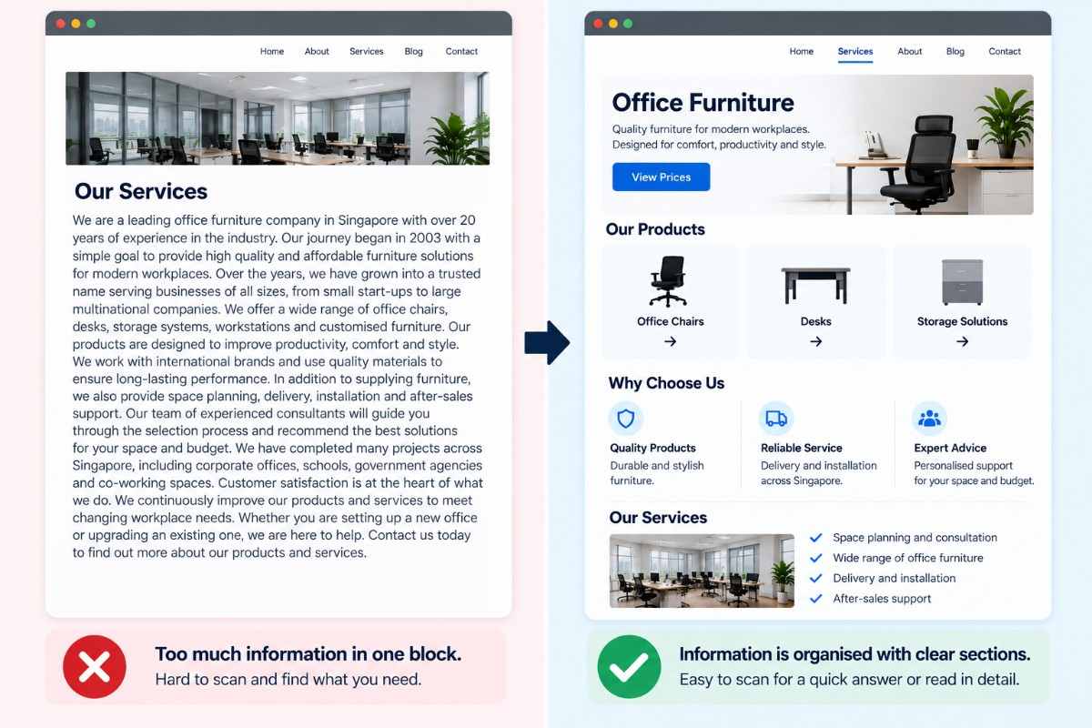
Long pages aren’t automatically bad. Some services need explaining. Visitors comparing options may want the detail, and cutting it all out would leave them with more questions.
The trick is to organise it properly. Put the main information first. Break up long sections with useful headings. Keep paragraphs readable. Good website design lets people scan for a quick answer or read the whole page if they want to. Both should be easy.
Start with a simple question: does this information help the visitor? Not the business. The visitor.
It’s easy to keep adding content because a detail seems important internally. But a customer may not need it on that page. Some information belongs elsewhere; some can go.
Think about what someone expects to find. On a service page, they probably want to know what’s included, whether it suits their needs and how to enquire. An about page has a different job. It should tell people who the business is and why its background matters.
Read the page with fresh eyes. Does each section answer a question? Is the same point repeated elsewhere? If a paragraph adds nothing useful, remove it. Website design works better when every section has a reason to be there.
Numbers can help, but don’t read too much into one metric. If people leave a page quickly, that doesn’t automatically mean it’s too long. Perhaps they found what they needed. Perhaps they couldn’t find anything useful. You need more context.
Look at navigation patterns, conversions and customer feedback. Ask people what they struggled to find. Sometimes the answer is surprisingly simple: the phone number was buried, the menu label made no sense, or the important detail was halfway down the page.
| Website issue | What to improve |
|---|---|
| Too much text | Remove repetition and unnecessary details |
| Crowded navigation | Group related pages under clear labels |
| Unclear headings | Use headings that explain each section |
| Too many calls to action | Highlight the main action |
| Long paragraphs | Break content into shorter sections |
| Poor mobile layout | Make text, menus and buttons easier to use on smaller screens |
| Outdated information | Remove or update details that no longer help visitors |
Once the content makes sense, look at the layout. Where does the eye go first? Can visitors tell one section from another? Is the next step obvious?
These aren’t huge changes in every case. Sometimes a clearer heading or a bit more spacing fixes the problem.
If every heading, button and banner demands attention, visitors don’t know where to look. Give the important things room to stand out. Use headings to separate topics, spacing to make sections easier to follow and buttons to highlight the main action.
A good web design in Singapore project should make the page feel organised without stripping out useful detail. Website design in Singapore should also account for how people scan information. Nobody wants to fight their way through a wall of text.
A page that looks fine on a desktop can be a different story on a phone. Menus feel cramped. Paragraphs seem endless. The button someone needs is nowhere in sight.
Open the website on a mobile device and actually try using it. Can you find the service? Is the text readable? Can you contact the business without pinching and zooming all over the screen?
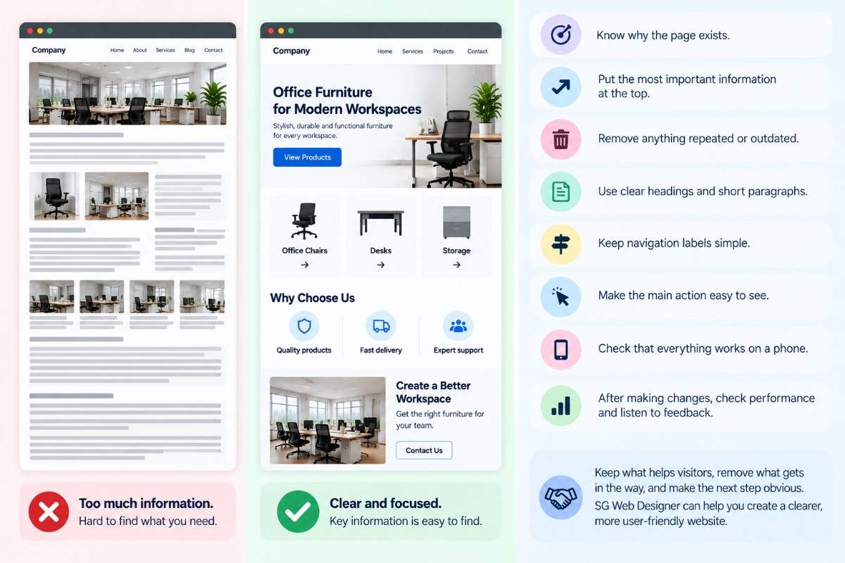
You don’t always need to rebuild a website to make it easier to use. First, see if people can actually find what they’re looking for and do what they came to do. Tackle the obvious issues right away.
When you’re reviewing a web page, use this checklist:
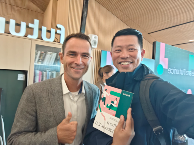 Our Director Mr Terence Sim, in Finland visiting Mr Jonas Trindler, Group CEO of Futurice.
Hold onto details that genuinely help visitors, scrap anything that gets in their way, and keep the next step obvious. SG Web Designer is a solid choice if you’re looking for help making your website more user-friendly and straightforward for visitors.

Terence Sim is the founder of iClick Media, a leading digital marketing agency. With deep expertise spanning web design, SEO, AEO, GEO, and social media marketing, he helps brands build dominant online presence and navigate the evolving search landscape. When he isn't driving digital growth for clients, Terence writes about the future of AI-driven visibility and search technology.